Zobio
CATEGORY
Webdesign, Logo design, Re-branding
CLIENT
Zobio
REALIZED AT
Furnuft
LINK
https://zobio.com/
CASE
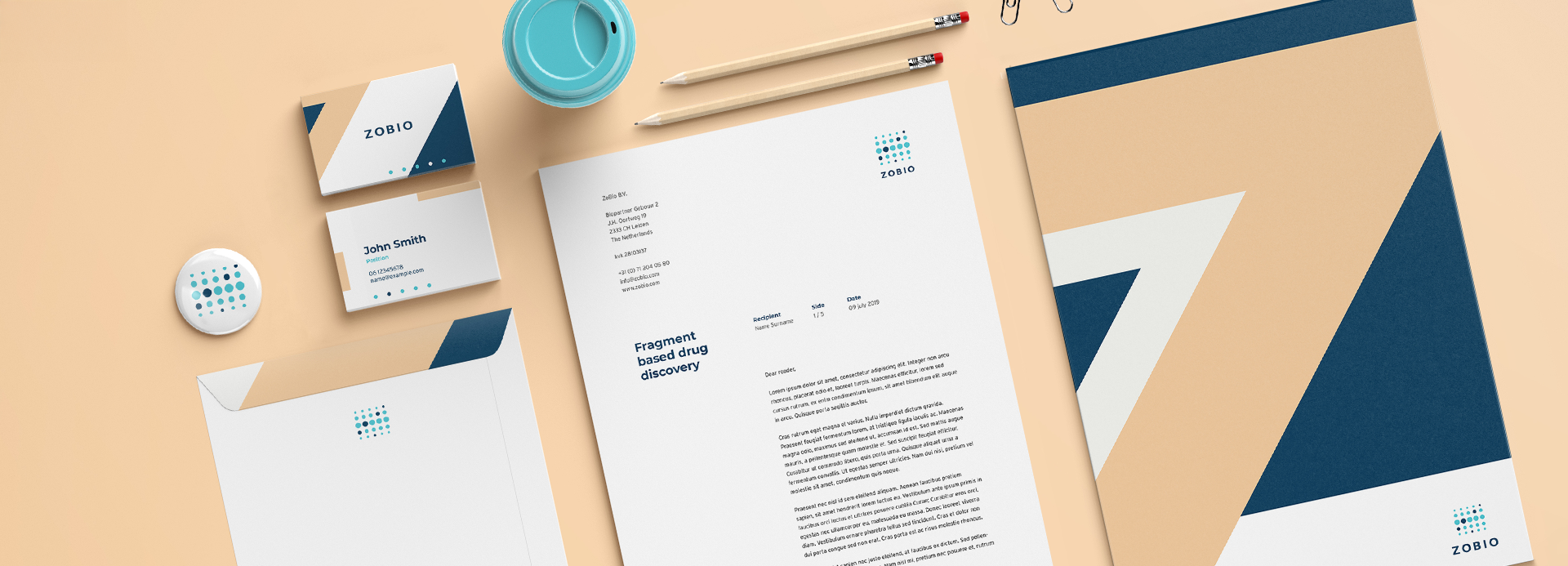
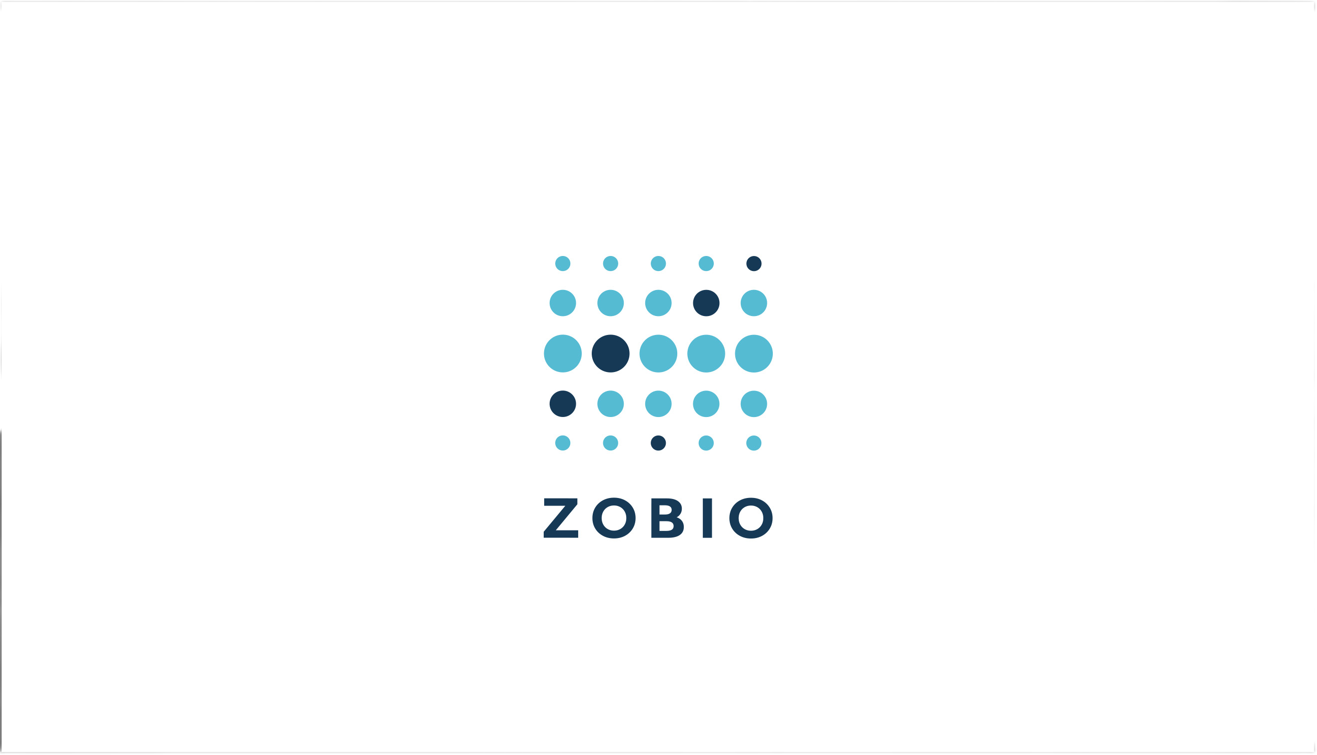
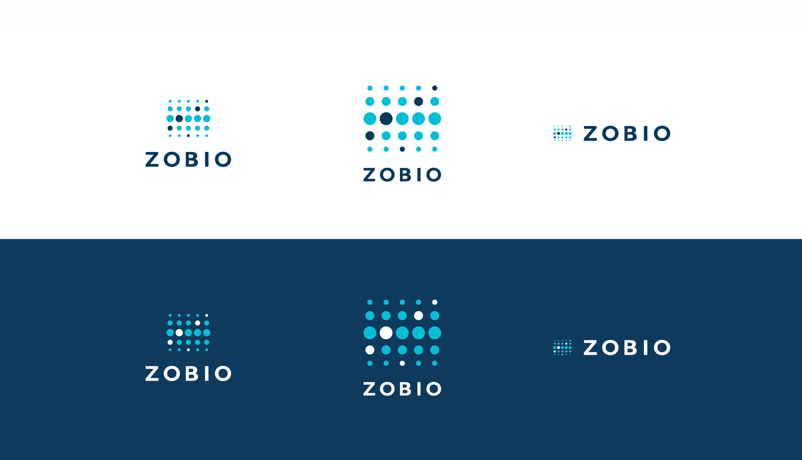
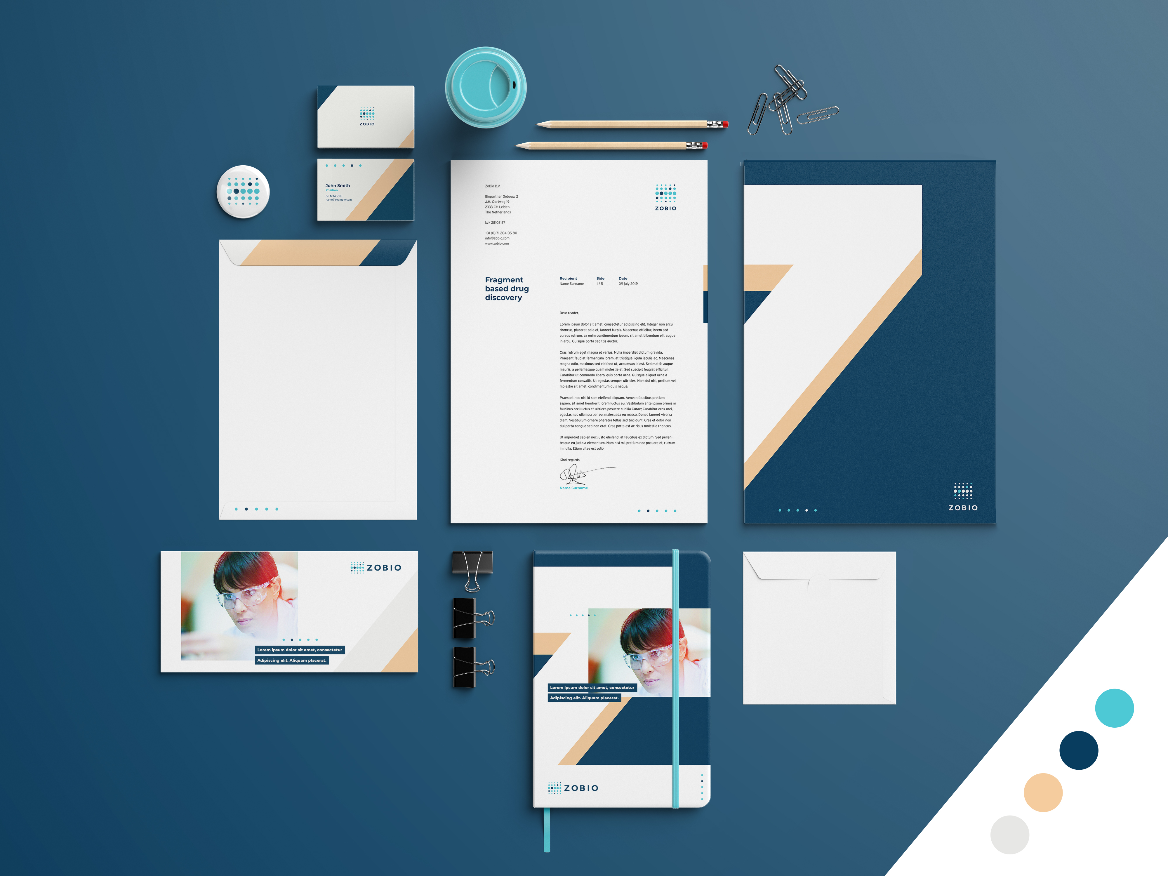
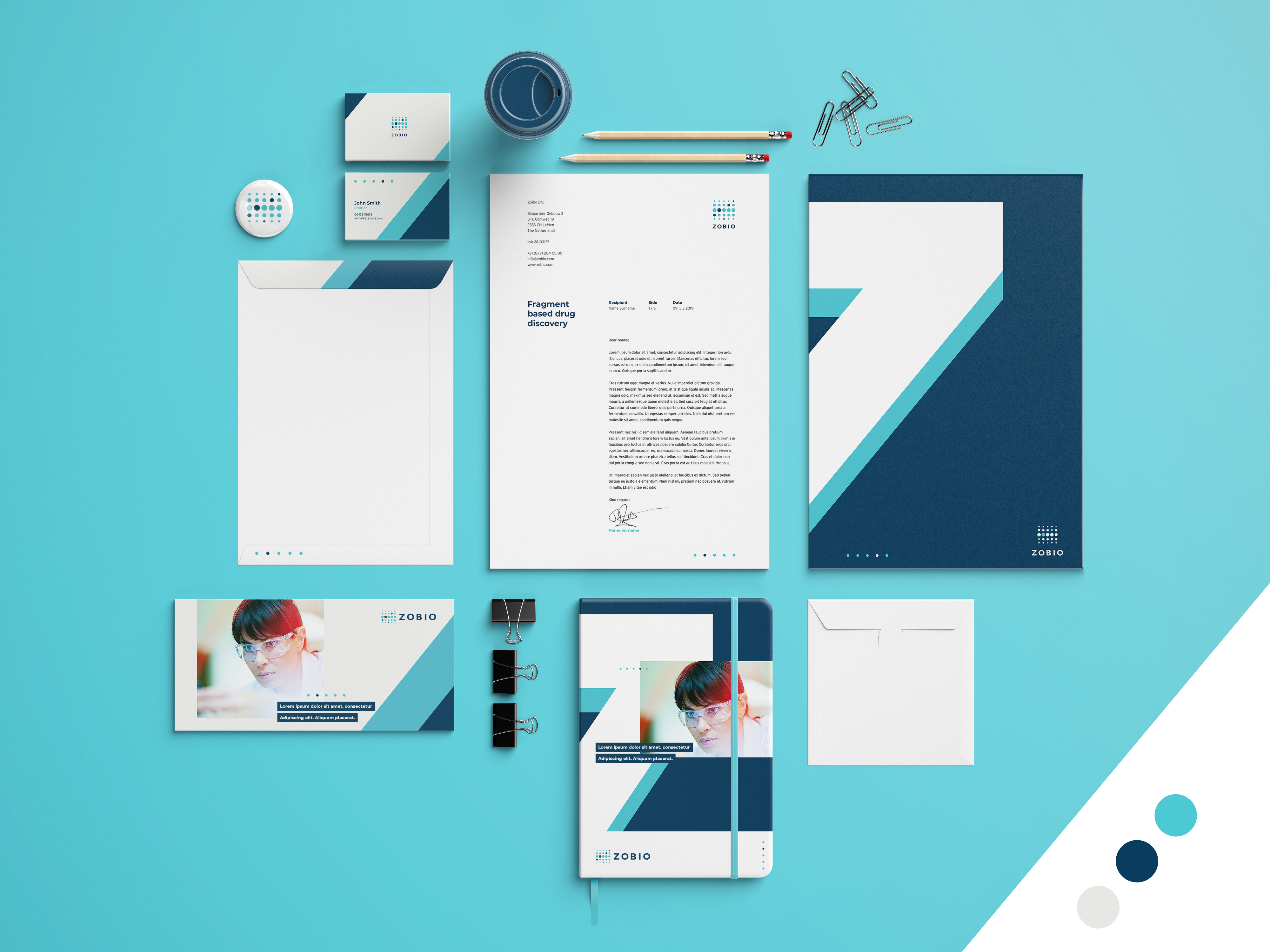
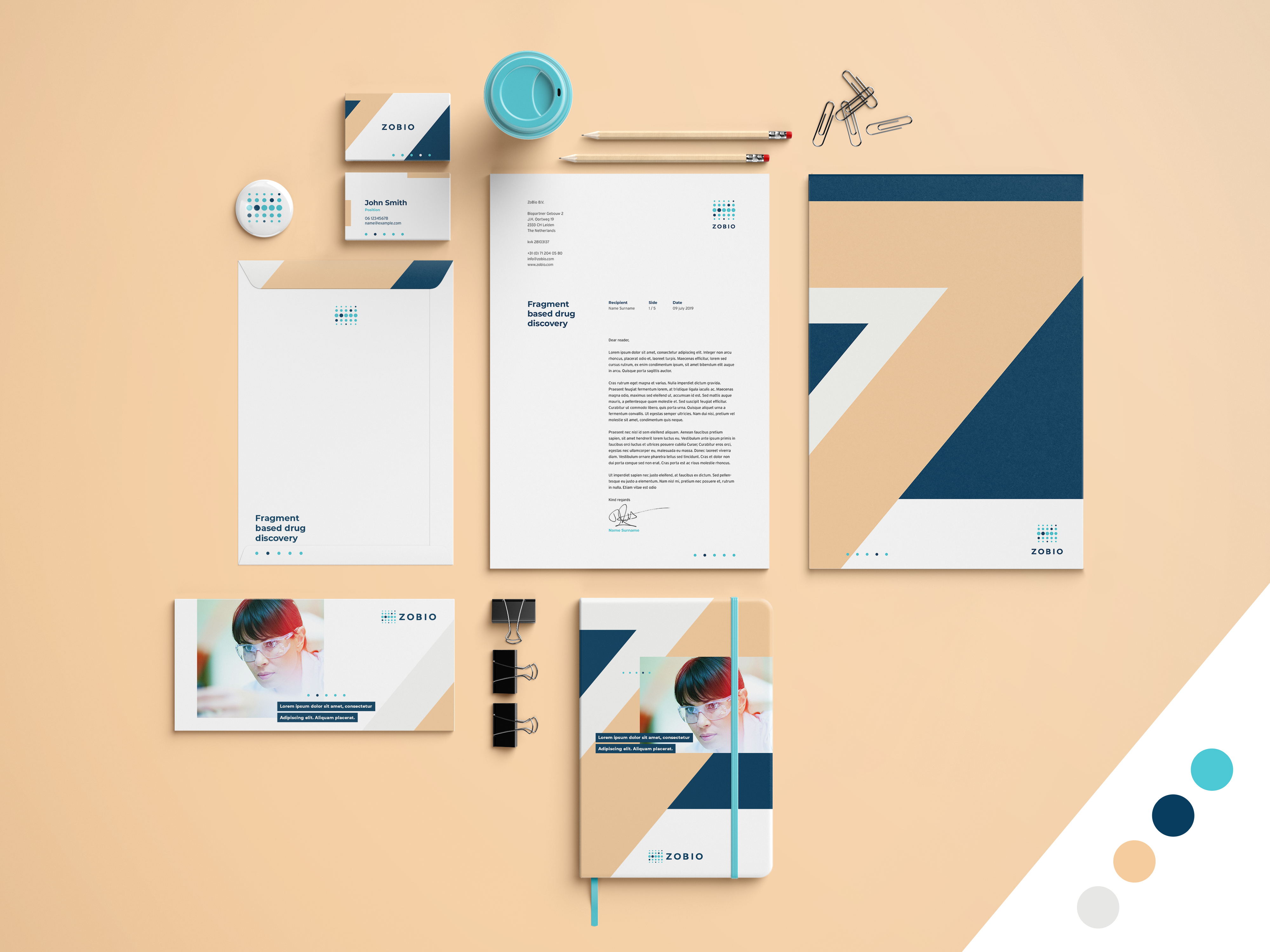
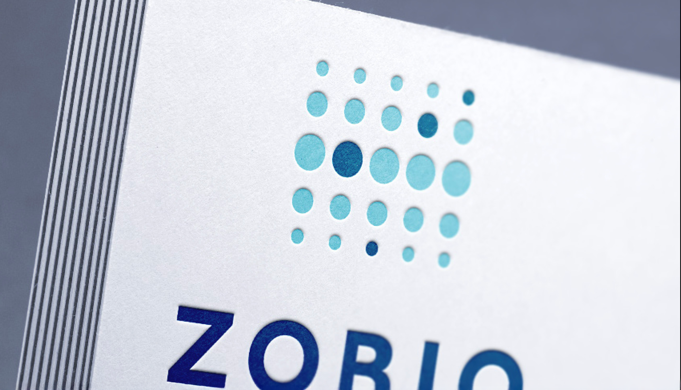
Zobio is a research institute focused on gene-to-structure research in the early stages of drug discovery. Their old website, dating back to the early 2000s, featured outdated design elements, including a clunky animated logo with spinning spheres. The CEO was particularly attached to this old logo, so as a compromise, I refreshed the design by modernizing the logo, keeping the spinning spheres as a metaphor for finding the right cellular combination, but giving it a sleeker, more contemporary look.
I revamped both the website and branding, opting for a clean, tech-inspired aesthetic with bold shapes and colors. The use of blue represents the scientific and technological side of the company, while the soft rose hue symbolizes the human side of Zobio's mission; helping people. The result is a cohesive, modern identity that reflects the company’s innovative work and compassionate goals.


MORE WORK?
︎︎︎ scroll down︎︎︎Martijn Mandemakers 2025 — Amersfoort